Aer Lingus Unveils Refreshed Brand
January 17, 2019
IAG airline Aer Lingus revealed its new logo and aircraft livery at its Dublin base on Thursday.
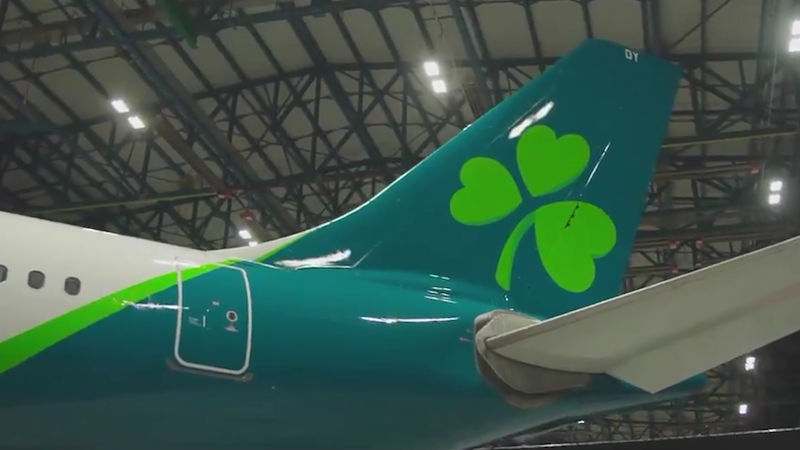
The new logo retains the Irish carriers iconic shamrock, tweaking it slightly “to symbolise dynamism and speed,” and reshaping the shamrock’s leaves as hearts to “reflect the warmth and hospitality of the brand.” A new font completes the new brand logo.
![]()
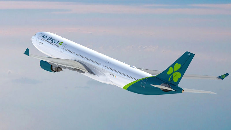
The logo’s teal colour dominates the aircraft tail fin, with a large shamrock the only other design element. A lighter green edge emerges from the tail and wraps round the fuselage providing a buffer between the teal of the tail and white of the body.
The aircraft engines and wingtips in teal contrast with the otherwise white body. The airline’s name in the new diodrum font adorns the front of the aircraft.
The Dublin-based airline is rolling the brand update out across all platforms, with new website and app designs available already. The airline’s fleet will be repainted in stages over the next 2-3 years.
Aer Lingus chief executive Sean Doyle said “We’re delighted to unveil our brand refresh today, which comes more than 20 years after Aer Lingus last invested in new brand livery, and reflects our position as a modern, contemporary airline.”
The brand refresh is part of the airline’s growth strategy which will see the North Atlantic fleet increase from 17 to 30 aircraft by 2023. The airline plans to grow its A330 fleet to 16 aircraft and add 14 new A321LRs to provide additional capacity across the Atlantic and within Europe.